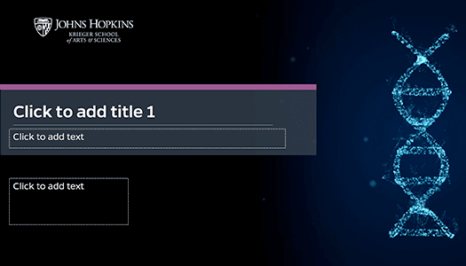
Our team of designers has meticulously crafted our PowerPoint templates to optimize the learning experience for students. Each template is thoughtfully designed based on evidence-based principles to ensure the delivery of effective presentations.
Additionally, upon request, our graphic design team can create a customized template tailored to fit the requirements of a specific course or program.
- User-friendly interface for easy navigation
- Incorporation of relevant and captivating images
- Font cues, including varying text sizes, bolding, and callout sections, guide students to essential information effectively
- Availability of tables and charts to enhance content comprehension
- Absence of distracting slide transitions or word animations
- Thoughtful color selection, avoiding yellow, pink, red, and green for improved accessibility
- Utilization of bulleted lists for efficient organization of information
- Steer clear of slide transitions as they may distract the audience
- Stick to the template slide layouts or utilize the default predefined layouts in PowerPoint if adjustments are needed
- Craft content that is concise and legible
- Avoid using text that you will read directly on the slide. It's better to use the slide as a visual aid to support your spoken points rather than as a script
- Ensure all content flows logically from left to right
- Keep slide titles and overall content brief
- Adhere to the "Rule of Six": no more than six bullets per slide, and each bullet should contain no more than six words
- Avoid using extensive blocks of italicized, capitalized, or underlined text
- Eliminate moving, flashing, or auto-refreshing text
- Refrain from using phrases like "click here" or "more" for links
- Limit the number of links, aiming for fewer than 10
- Do not use text boxes in place of the template content boxes
- Include copyright information for images either on each slide or on a single designated slide
- Avoid incorporating graphics or images that are unrelated to the content
- Opt for high-quality, clear images; avoid using small or blurry ones
- Steer clear of animated images, such as GIFs
- Minimize the use of tables for presenting data; do not employ them for slide layout purposes
- Avoid including large tables or providing detailed descriptions within the slide; aim for simplicity
- Use a straightforward table structure where the data is easily predictable and navigable
Slide Layout and Structure
Text
Graphics and Images
Tables and Charts
Rights Free Images
Where can rights-free images be sourced?
High-quality images bring life to your presentations. The MM Team can create images for you, but there is also the option of sourcing images from sites.
Please download the JH Libraries Copyright Tips of Faculty document for more copyright information and image sources.
*Access to the collection gallery requires membership. Please fill out the multimedia request form for assistance in acquiring content.
Seeking Help with Your PowerPoint Presentations?
If you need assistance, please complete the multimedia request form. Before submitting your request, please keep the following in mind:
- Presentation Length: Provide the number of slides and the anticipated duration of the presentation
- Learning Objectives: Specify what students will know or be able to do as a result of the presentation
- Image Sourcing: Indicate the number of images needed and their source (e.g., Adobe Image Stock, Google, Government)


